06
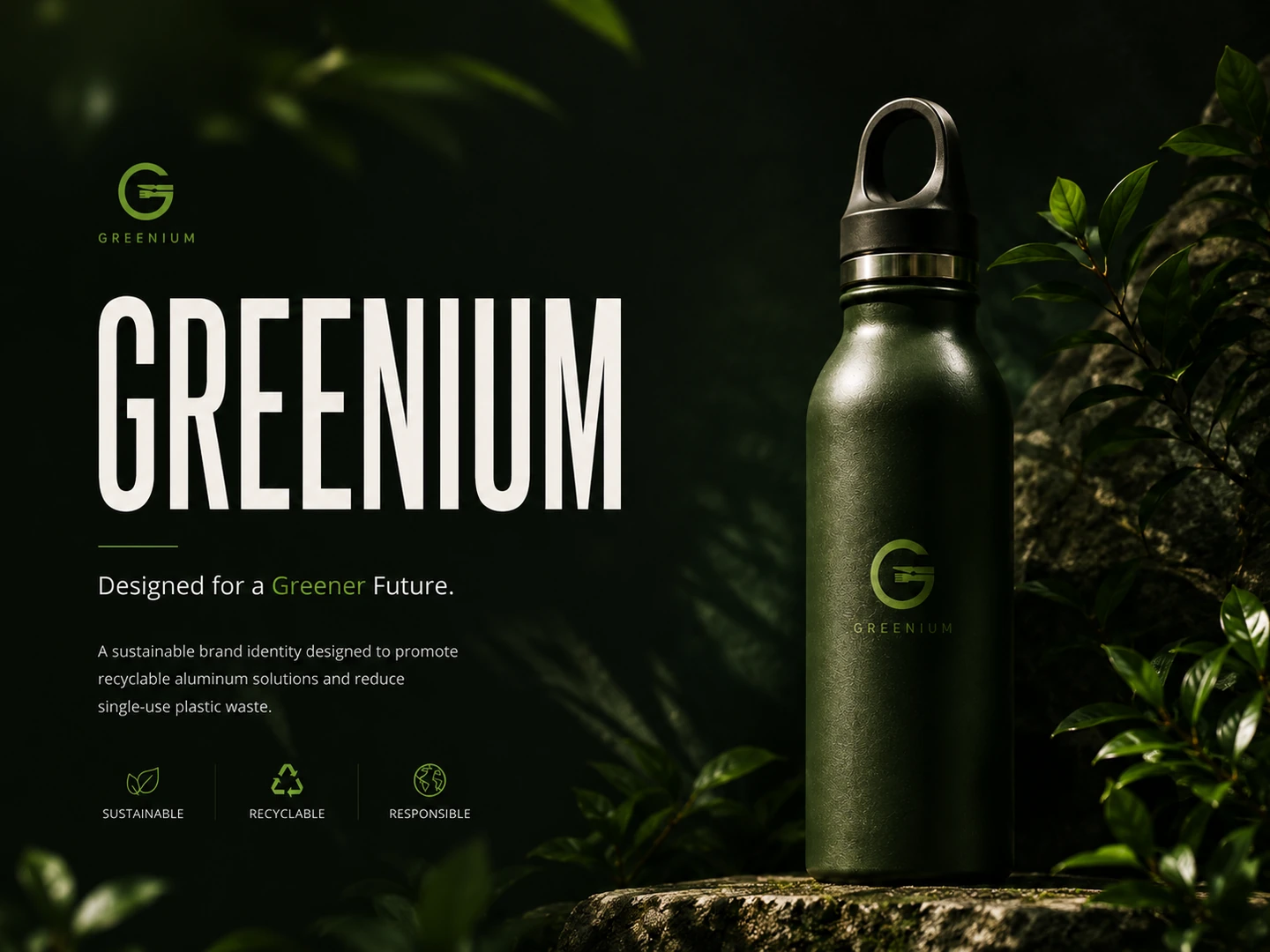
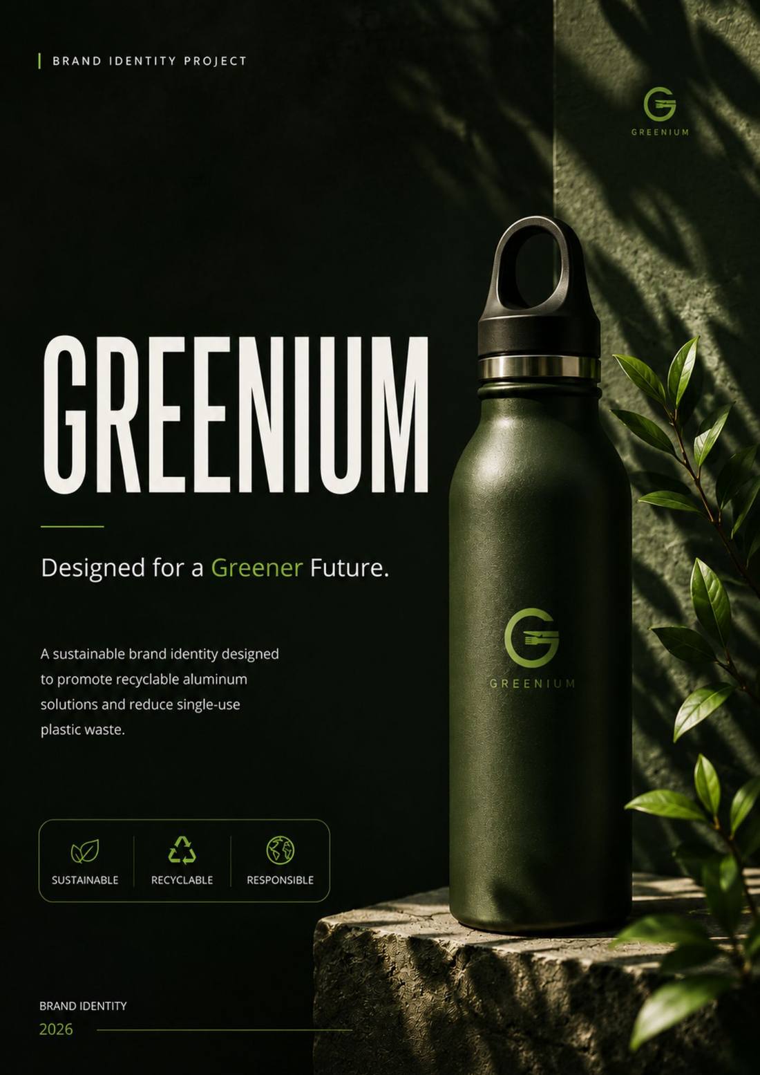
Greenium
Brand Strategy · Identity · Packaging · Guidelines2026
The problem
Every sustainable brand reaches for the same shorthand — kraft paper, leaf icons, earthy greens. Greenium couldn’t afford to look like the category it was trying to improve.
The identity needed to carry real environmental responsibility across packaging and materials while staying recognisable as the range grows — without defaulting to eco-cliché.
The solution
Restraint as strategy — fewer visual elements, each one doing more work.
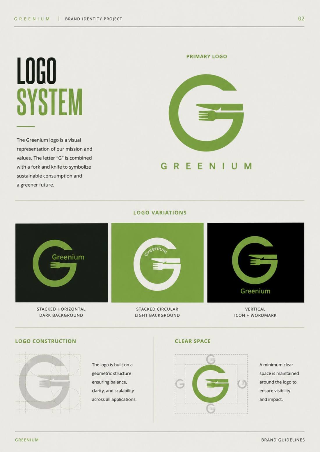
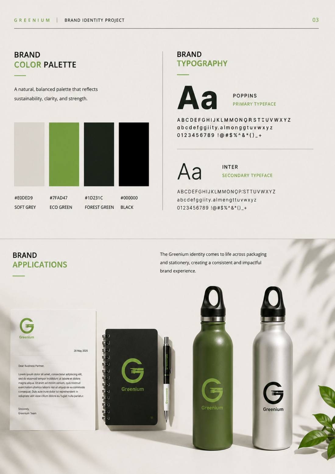
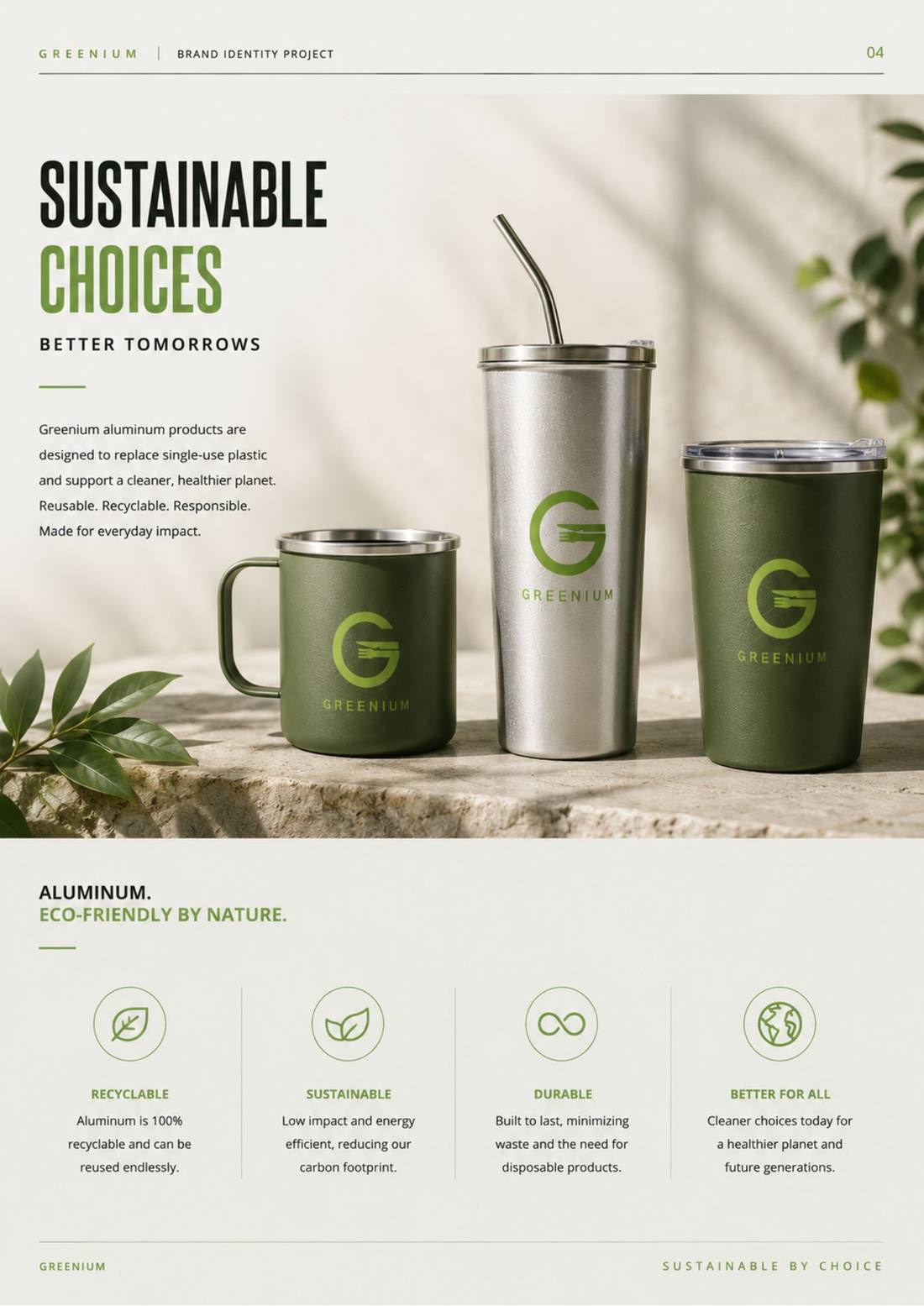
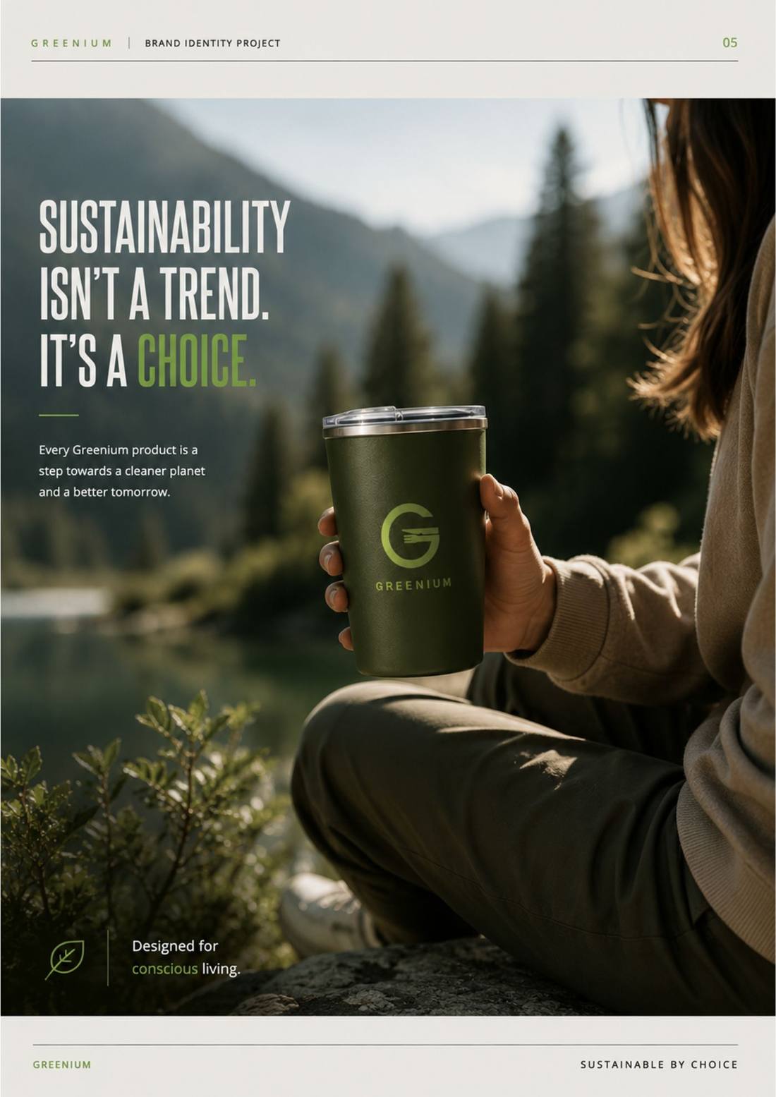
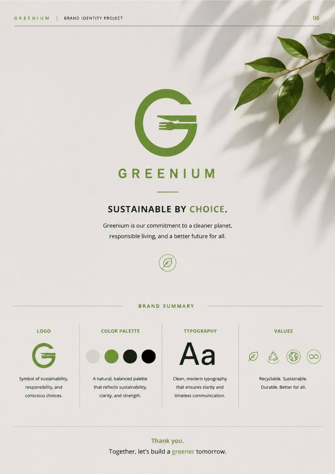
A compact monogram, a natural but disciplined palette, accessible typography and consistent product applications give Greenium a presence that reads as serious rather than decorative — across packaging, stationery, campaign imagery and brand guidelines without leaning on the usual green-brand tropes.
Scope
Brand identity · logo system · colour and typography · packaging · applications · guidelines
Role
Independent — concept, identity, packaging, brand system
Brand line
“Sustainable by choice.”