08
Power Pack
Brand Identity · Packaging · Campaign Visual2026
The problem
How do you package a promise you can’t see? Focus isn’t a flavour or a colour — it’s an outcome.
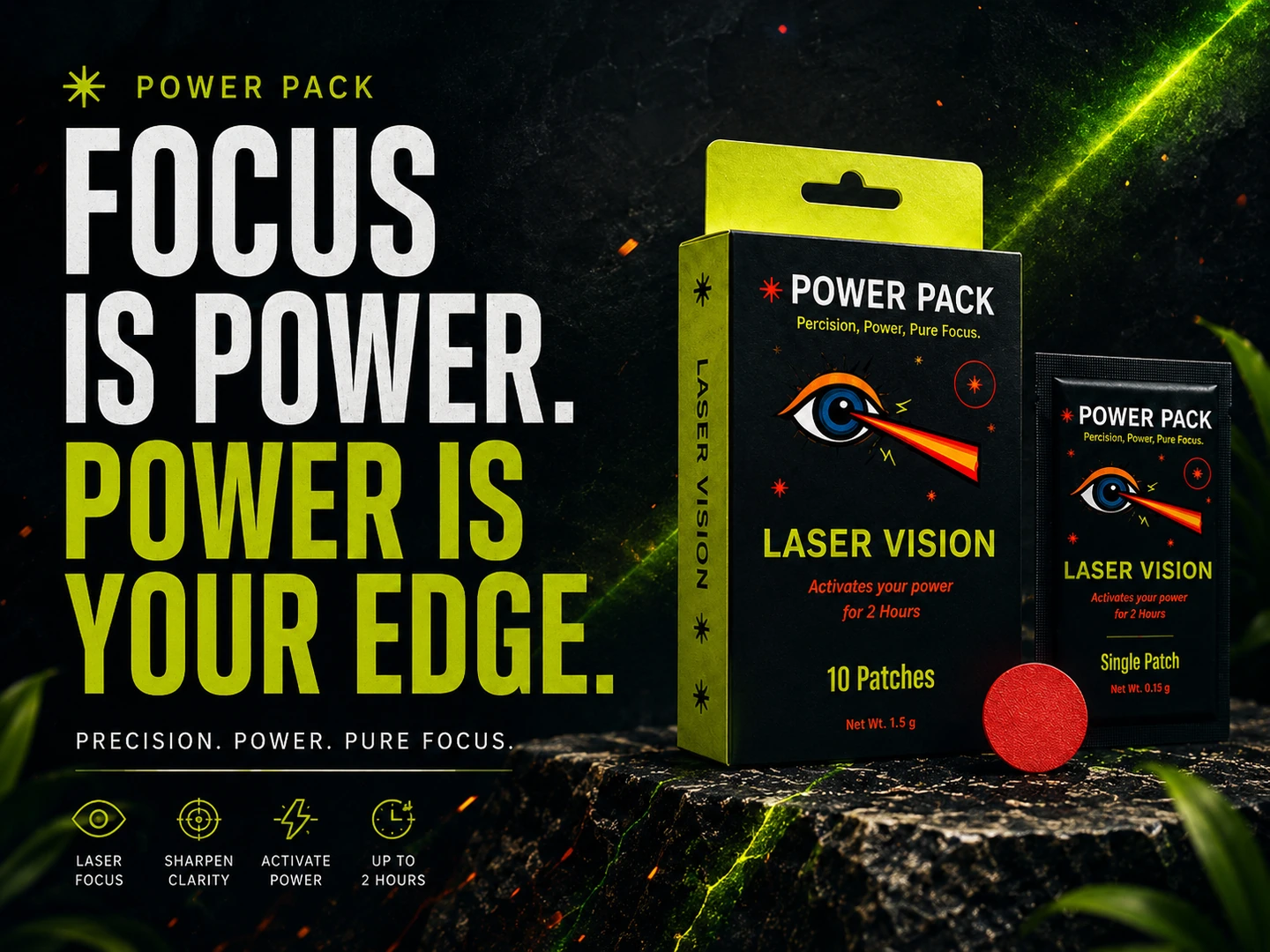
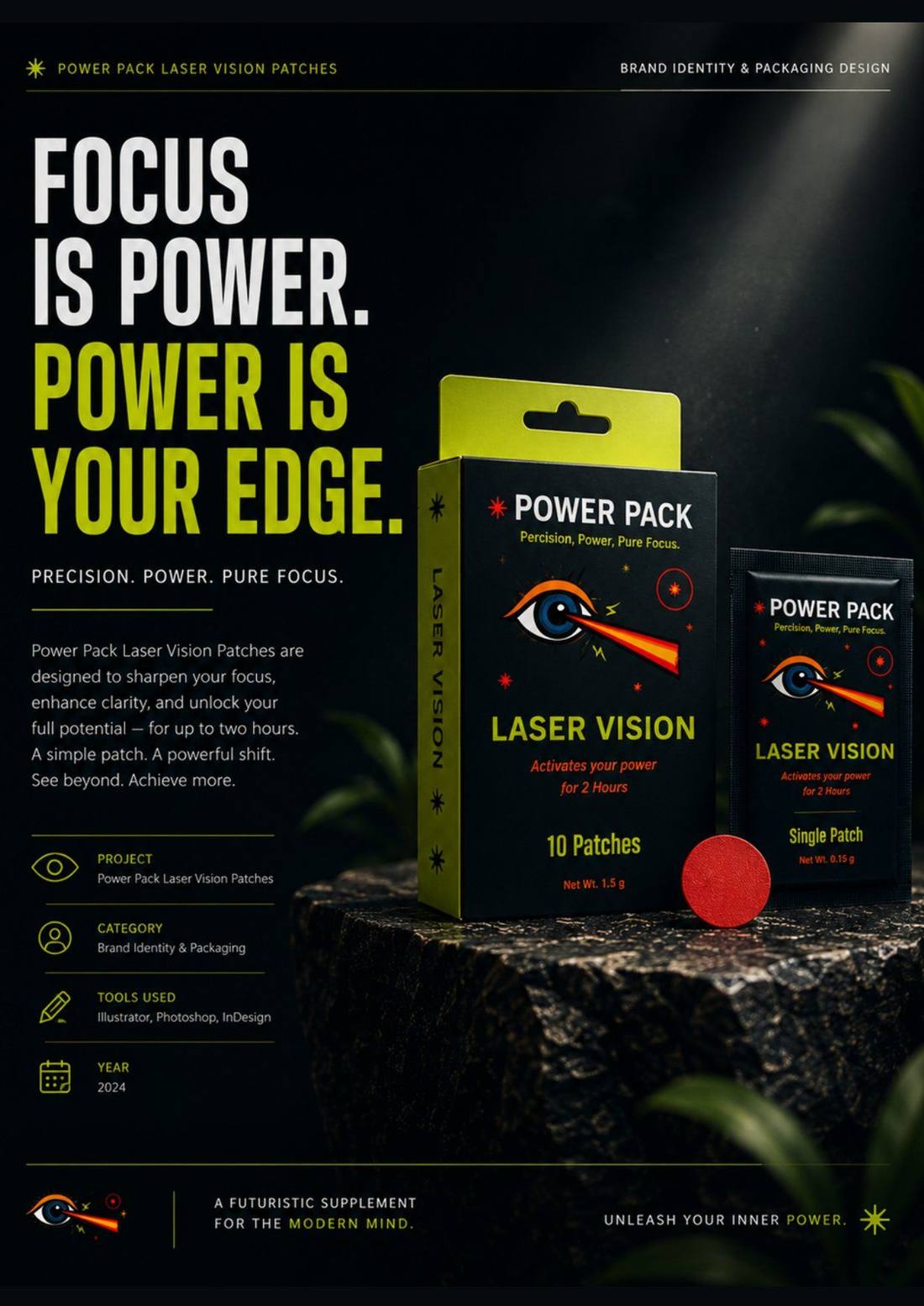
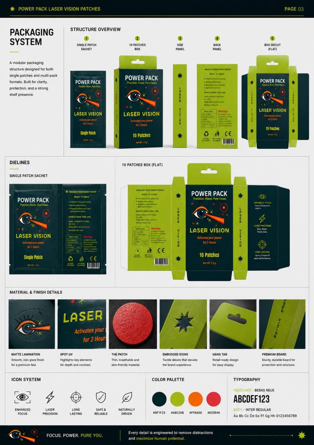
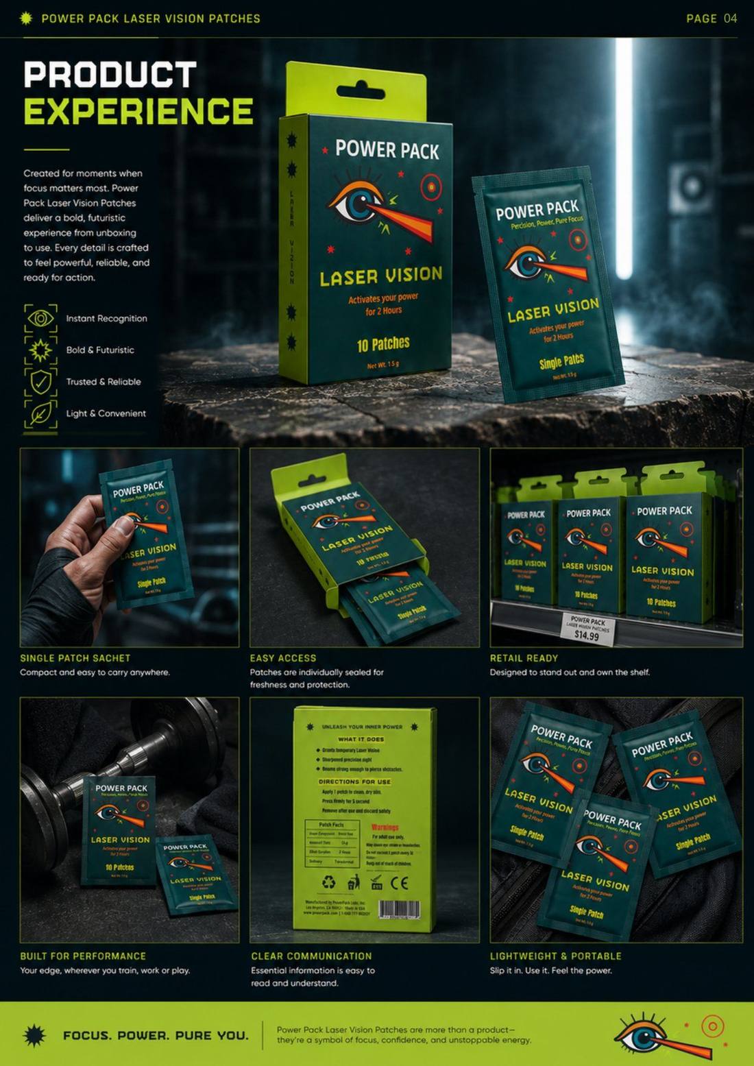
This self-initiated concept explored how to give an intangible benefit — concentration — a credible visual identity and a packaging structure that works as a real retail object, not a portfolio-only render.
The solution
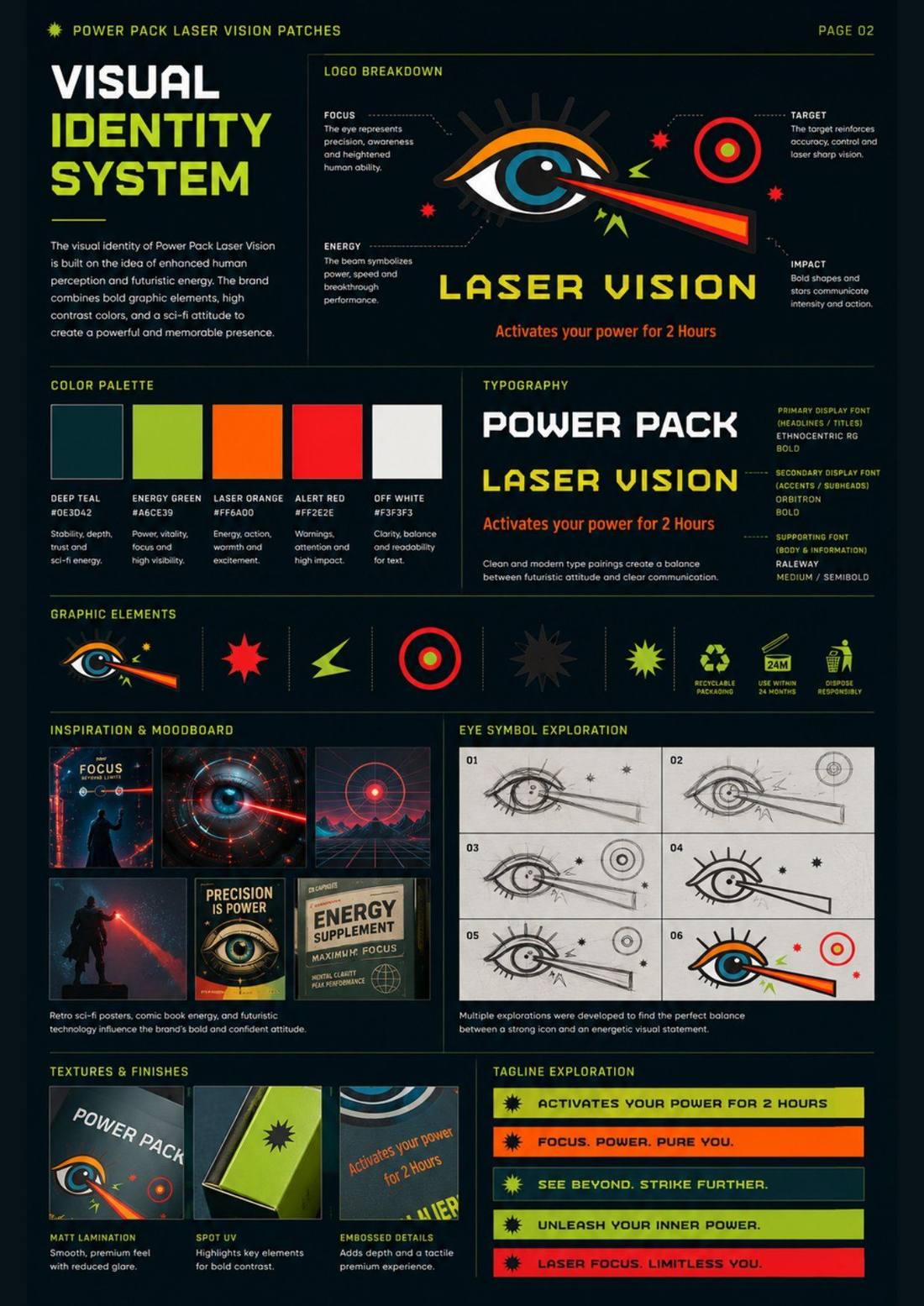
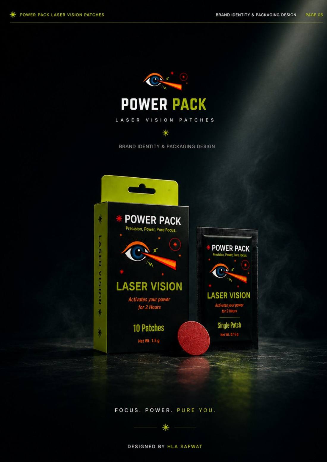
One symbol that makes the abstract concrete: an eye projecting a precision beam.
The mark translates perception and target focus into a single recognisable shape. A controlled neon palette, technical typography, icon system and production-ready packaging structure — including dielines and finish specifications — carry the concept across the full product family.
Scope
Naming direction · identity · icon system · packaging structure · dielines · finishes · campaign visual
Role
Independent — concept through production-ready packaging
Status
Self-initiated concept