09
Film Posters
Poster Design · Visual Direction · TypographyUnofficial concept work2023
The problem
A poster gets one frame to tell someone how a film will make them feel. No motion, no sound, no second chance.
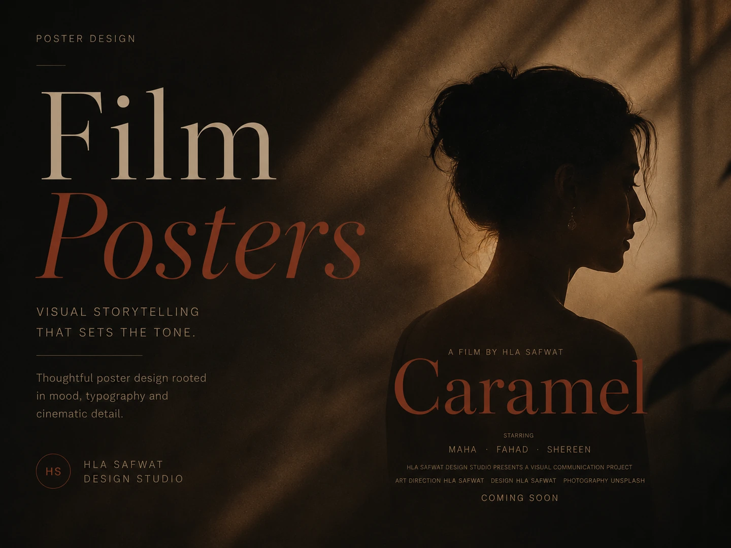
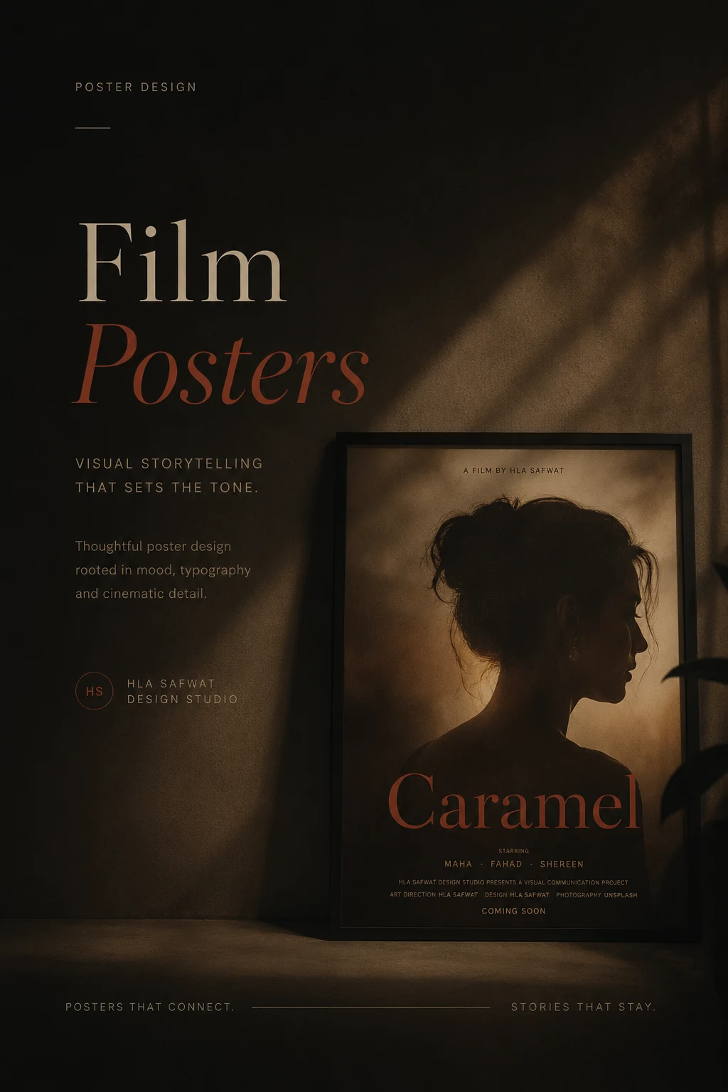
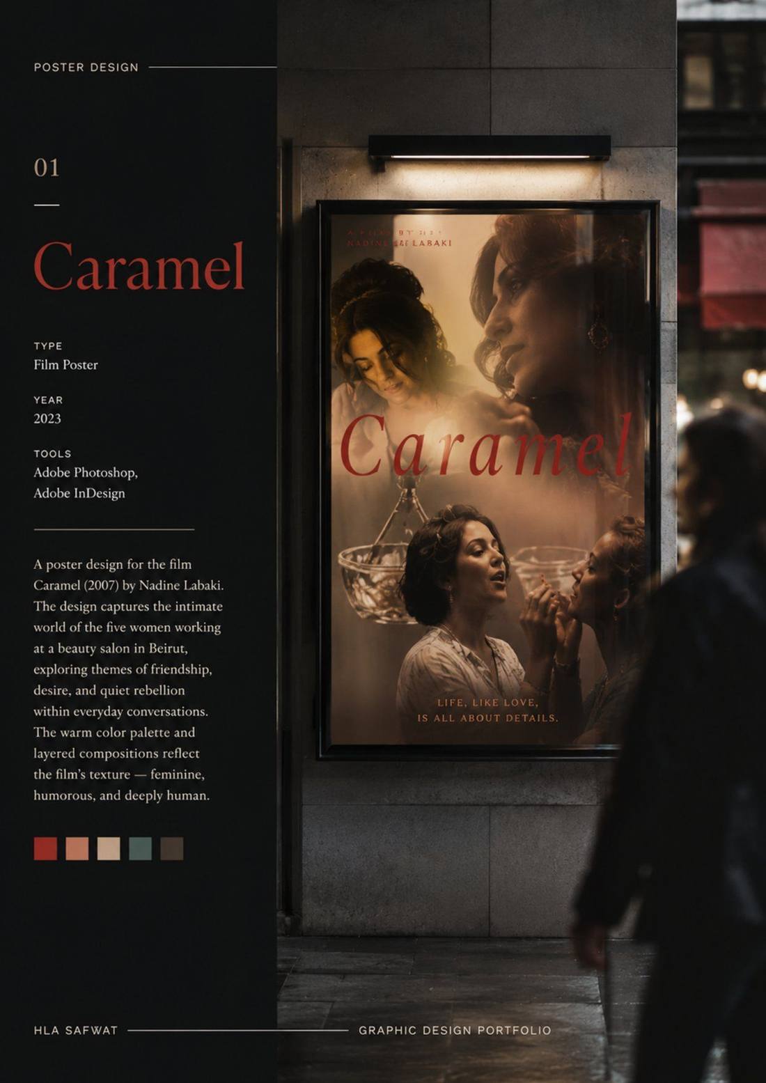
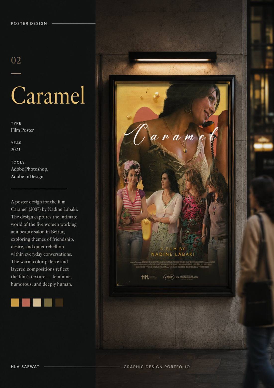
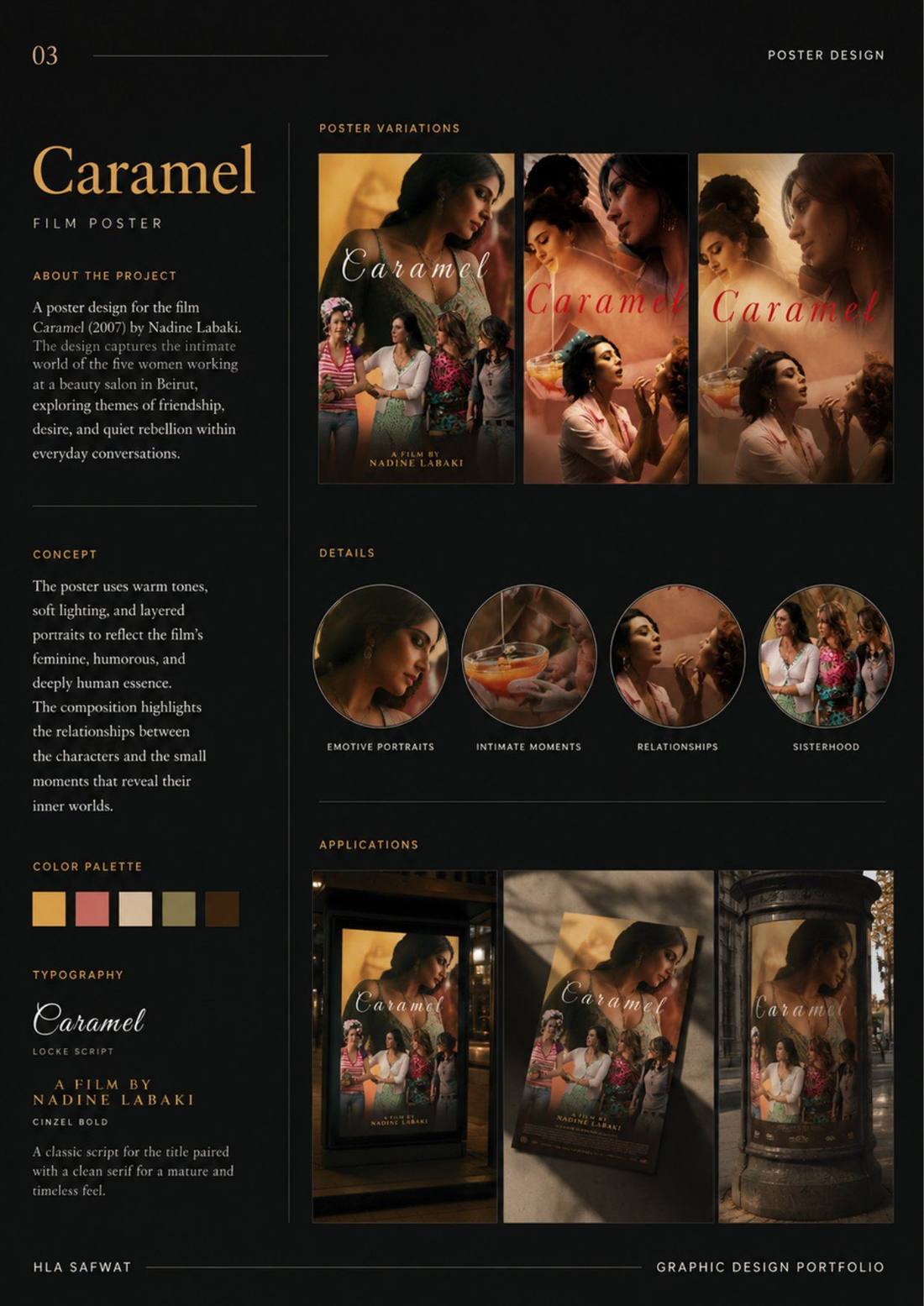
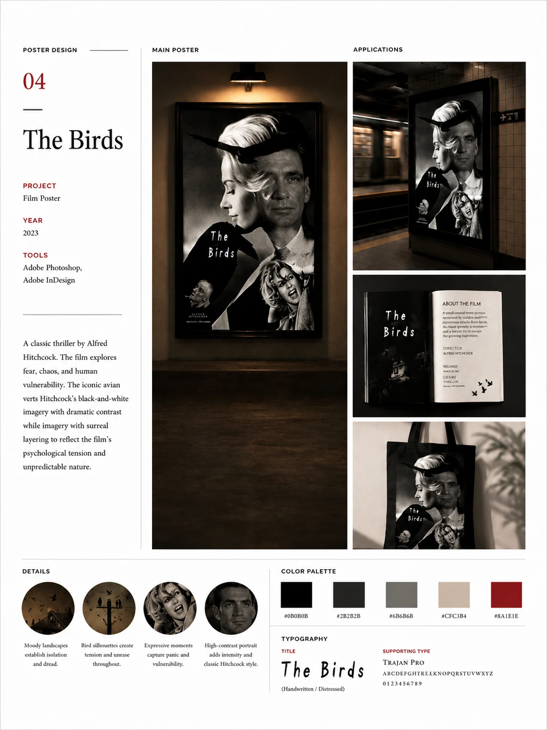
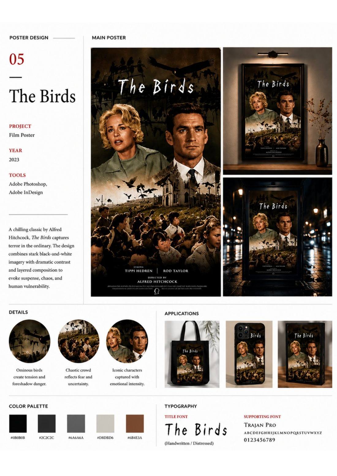
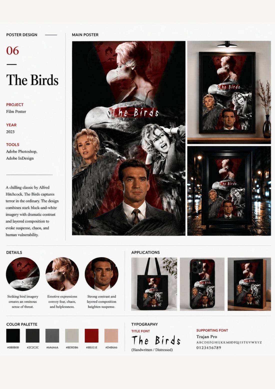
These two films required opposite visual languages: Caramel depends on warmth, intimacy and layered relationships; The Birds depends on unease, contrast and psychological threat.
The solution
Two poster systems built from the narrative DNA of each film — not from a house style.
Typography, palette, image construction and composition were tailored to each story, then tested across poster variations and in-situ applications. The work shows how visual direction should be concept-led, not style-led — the same discipline producing fundamentally different emotional outcomes.
Films
Caramel (Nadine Labaki, 2007) · The Birds (Alfred Hitchcock, 1963)
Scope
Poster directions · typography systems · palettes · in-situ applications
Role
Independent — concept, typography and poster direction
Note
Unofficial concept work; not commissioned by or affiliated with the films or rights holders